Website Design: Mastering Visual Hierarchy
Introduction
Visual hierarchy is one of the most powerful tools in website design. It’s how designers guide visitors through a page, directing attention to what matters most. At Doorzy Tech, we apply visual hierarchy to every project to ensure that users find information easily and stay engaged longer.
What Is Visual Hierarchy?
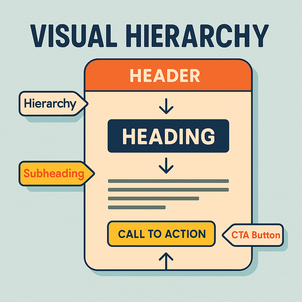
In simple terms, visual hierarchy is about arranging design elements to show their importance. When a user lands on your website, their eyes naturally follow a path—from bold headlines to call-to-action buttons and supporting details. Using size, color, spacing, contrast, and placement, we create a visual flow that leads visitors exactly where you want them to go.
Why Equal Emphasis Fails
A common mistake is trying to make everything on a page stand out equally. When all elements compete for attention, nothing truly stands out. Our design process prioritizes clarity and structure: we highlight key elements—such as contact buttons, service highlights, or featured products—while maintaining balance with supporting visuals and text.
Core Principles We Use
- Scale & Size — Larger headings and primary CTAs draw the eye first, establishing a clear reading order.
- Color & Contrast — Bright, high-contrast tones emphasize important actions; softer palettes recede for supportive content.
- Typography — Distinct heading levels, readable body text, and consistent line spacing improve comprehension.
- Spacing & White Space — Generous margins and padding give content room to breathe and reduce cognitive load.
- Placement & Alignment — Strategic positioning (F-pattern/Z-pattern) and grid alignment create a natural viewing flow.
- Visual Grouping — Proximity and section headings cluster related items so users can scan quickly.
- Consistent Patterns — Reusable components (cards, buttons, badges) teach users what to expect and where to act.
How We Apply It at Doorzy Tech
- Goal-First Layouts — We define the page’s primary action (call, quote, purchase) and design everything to support it.
- Actionable CTAs — Prominent, consistent buttons with clear labels and adequate contrast meet accessibility standards.
- Scannable Sections — Short paragraphs, bullet points, and subheads help visitors find answers fast.
- Media with Purpose — Images and illustrations are used to reinforce messages, not distract from them.
Design Details That Matter
- Color Strategy — Accent colors are reserved for actions; neutrals support readability.
- Type Hierarchy — H1/H2/H3 scale sets clear priorities; body text remains legible across devices.
- Rhythm & Spacing — Consistent vertical spacing creates a smooth scroll experience.
- Micro-Interactions — Subtle hover states and motion cue interactivity without stealing focus.
Results You Can Expect
- Higher Engagement — Users find what they need faster and stay longer.
- Better Conversions — Clear pathways lead more visitors to take action.
- Stronger Brand Perception — Professional, orderly design builds trust instantly.
Conclusion
A website without visual hierarchy is like a story without structure. When your layout, colors, and typography work together, they create a seamless journey for your visitors. At Doorzy Tech, we combine strategy, design, and usability to craft websites that look stunning, flow naturally, and deliver real results.